How to display Divi Blog in List Layout using CSS in Code Module
The blog module is one of the many modules in the Divi theme. The blog module displays the blog posts.
nanadwumor

- The blog module can be used to display categories of blogs on a page. The blog module can be displayed in a grid or a fullwidth
- You cannot display it in a list. To achieve this however, you need custom CSS to modify the blog’s features such as the featured image, post, meta, etc.
- You don’t have to know CSS. We provide the CSS code for you to copy and paste to edit your website instantly.
RECOMMENDED ARTICLES
Some WordPress wp_config file Hacks you did not know
The wp-config file is a core WordPress configuration file. This file is generated during the WordPress installation and contains details specific to your installation and server environment. Read this article if you want to know the structure and meaning of the...
Top 10 websites to buy Instagram followers in 2021
Mark Zuckerberg crowns himself as the king of the social media space owning what many have come to refer to as the holy trinity of the social media campaign - Facebook, Instagram and Whatsapp. Instagram took the way pictures and short videos were shared by storm and...
500 Internal Server Error
The 500 Internal Server Error is one ofo the HTTP status codes. It is a generic error message your browser displays when an unexpected situation was encountered and the server cannot offer more specific information. The server delivers this error message to your web...
Divi is arguably the most powerful WordPress theme for almost everything. There are many reasons why you should use the Divi theme for your website.
The blog module is one of the many modules in the Divi theme. It displays the blog posts.
The blog module can be used to display categories of blogs on a page. It can be displayed in a grid or a fullwidth. You cannot display it in a list.
To achieve this, you need custom CSS to modify the blog’s features such as the featured image, post, meta, etc.
In this article, we look at how the Divi blog module can be made to display your blog posts in a catchy list style using CSS in the code module.
Using Divi extensions
Before we get you up to speed, let us mention that there are a number of Divi extensions you can acquire and immediately get your website styled in the way you want. Such extensions, as guessed, are not free but come at a small cost.
If you are the type who does not want to have anything to do with code, using these extensions will be a big relief.
Using custom CSS
Well, if you have continued reading up to this point then I’m certain you want to explore doing it yourself – adding a CSS code that does the magic.
First things first! CSS simply means Cascading Styling Sheet. It is a mark-up language used to style a website.
Chances are that you have heard of HTML before. HTML means Hypertext Markup Language. It is not a programming language like Java or C++. It is used to build the skeleton of a website.
After using HTML to build the framework, we use CSS to shape the website to get the style we want the site to appear.
Enough of the technical garbage! Isn’t it enough? Right. Let’s get back to what CSS code to put into our Divi builder. Shouldn’t we?
One more thing! Blog is one of the modules in the Divi theme. The modules are added to rows which are in tend added to sections. So let’s look at a step-wise method to add and set up the blog module to display the blog posts in a list style.
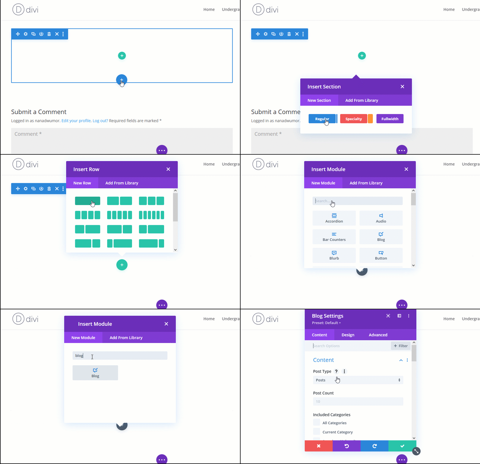
Step 1 : The first thing we do is to add a new section, row and blog module. We want the blog posts to be in a different section so that we can style the section if need be.
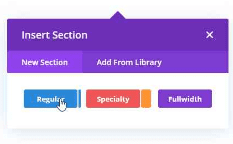
Click the plus button to add a new section if you don’t have a section already. The section appears in a blue color.


Add a regular section. The blue plus button adds a section.

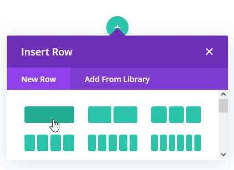
Add a one-column row. The green plus button adds a row.

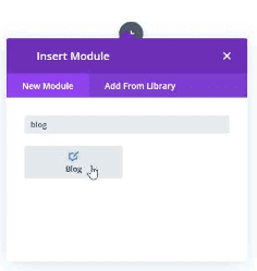
After adding a row, it’s time to add your blog module. Click the black plus button to add a module. Type blog in the search space and choose blog or scroll down and choose blog.

The above steps can be seen in the short gif below.

Step 2 : Click on the blog module to reveal a bar of options. Click on settings.


Step 3 : Click Design tab. Open the Layout block and set it to Fullwidth.
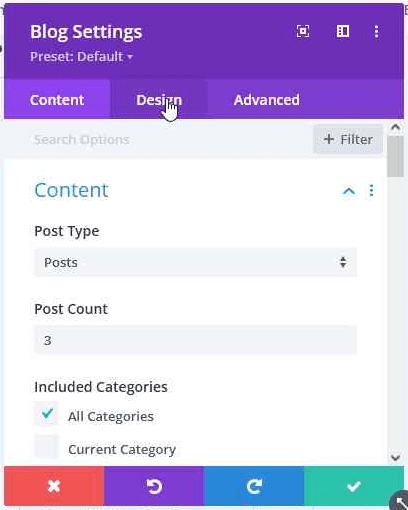

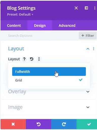

We need the blog post display to be in its full width before we can modify it to look like list display. You will see that the blog posts will now display in fullwidth. Don’t worry, we are yet to style it to make it look the way we promised in the beginning of this tutorial.
Step 4 : Click the Advanced tab, the next column in the settings blog. Open the CSS ID & Classes block.
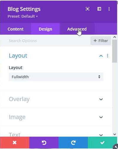

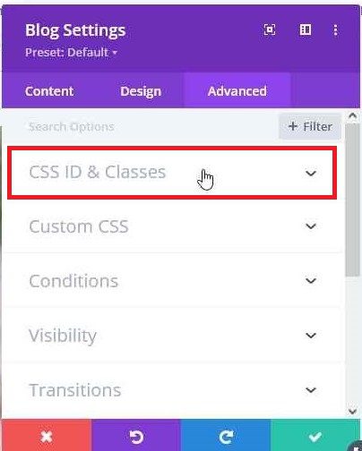

Step 5 : Under the blog module, click the black plus button to add a code module. Select the Content tab under the code module. Select the Text block. Copy and Paste the following code.
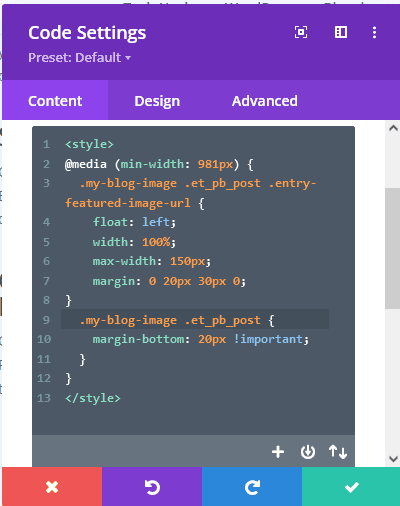

Modifying the code
You can modify the code to suit your interest. These include changing the image size, padding or margin between image and text, and many more.
Setting the image size
max-width : 150px;Setting the space between image and text
You can also adjust the space between featured image and the posts text.
This can be done by adjusting the value of the margin property.
margin : 0 20px 30px 0
The above margin means 0 for upper margin, 20px for left margin, 30px for bottom margin and 0 for right margin.
Note that margin values are arranged anticlockwise.
Setting the excerpt length
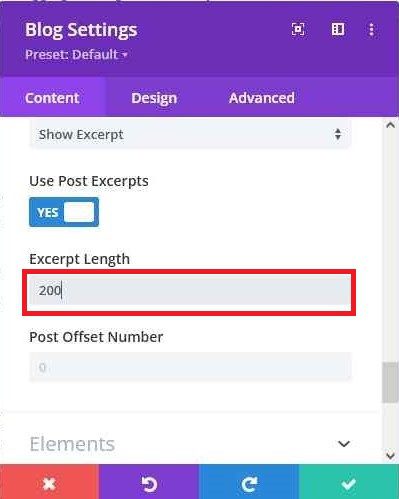
The excerpt length of the post can also be modified. By default, the number of characters for the excerpt is 270. This can be increased or reduced.
Click the settings icon of the blog module. Under the Content block, select Excerpt Length option. Type the number of characters you want displaced as the excerpt.

There is another way you can change the display of the blog module to list using CSS in the blog module itself.
Join Our Telegram Group
Join Our WhatSapp Group
You May Also Like…
What you must know about G-money to make your life easier
G-Money is GCB's MoMo business. It is a mobile money platform that facilitates the transfer of...
Is Your Android Phone Slow? These are Top 10 Ways You Can Speed it Up.
Is your Android phone slowing down, taking forever to load apps, or feeling more sluggish by the...
Some WordPress wp_config file Hacks you did not know
The wp-config file is a core WordPress configuration file. This file is generated during the...



0 Comments